Please login or click here to join.
Forgot Password? Click Here to reset pasword

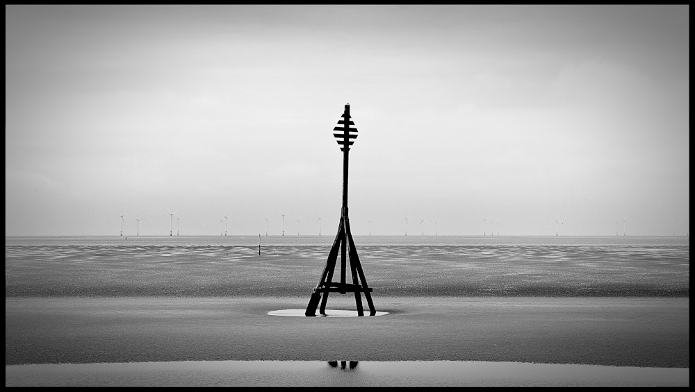
Indeed monochrome does work well Rod, and it does look an exposed place for a walk.
At first, I thought the marker post might look better off-centre, but I think the vignetting works well to complement its central positioning in the frame. I agree with Vince, 'exposed' seems to sum up the scene.
Simple but effective .
It looks wonderful in monochrome Rod. Wonderful composition.
Another effective monochrome image,well taken