Please login or click here to join.
Forgot Password? Click Here to reset pasword
 |  |  |  |  |  |
| Rod Burkey Posts: 554 Joined: 2nd Sep 2008 Location: UK | quotePosted at 10:24 on 30th April 2014 Black and White v Colour. I like both monochrome and full colour photography. When I see my images on the computer monitor I nearly always apply tweaks using Photoshop from the original RAW files. Some pictures really do lend themselves to a black and white conversion, whilst many do not in my opinion. Any thoughts? Is Black and White still valid? |
| James Prescott Posts: 25952 Joined: 11th Jan 2010 Location: UK | quotePosted at 11:33 on 30th April 2014 Rod,i enjoy looking at b/w photos i think they are more interesting to look at --what i would like to know is how did you alter the old lady with the bike and also the chap in the pub --two brilliant takes. |
| Rod Burkey Posts: 554 Joined: 2nd Sep 2008 Location: UK | quotePosted at 17:13 on 30th April 2014 James, The picture of the old lady and her bike in Chester (Image ID: 1079925) was converted to black & white to add a slightly vintage look and then I thought I’d try using a sepia tint to add to the effect. The Black & White adjustment layer in Photoshop has a colour filter and after playing around with the tint and saturation, I settled on the slightly cool sepia tone. To finish it off I decided to go for a vignette. A dark vignette was not going to work as well as one fading away to white and that is what I chose. The original colour version was okay but the sepia one has a stronger look. The man in the Huddersfield pub (Image ID: 1186985) quietly doing his crossword, enjoying his second pint, just attracted my attention. There was a strong winter light coming from the window that backlit the beer and my eye homed in on that as I shot off a quick shot, taking a chance at 1/13th second, holding my breath supporting the Nikon with my elbows on the table. When I opened up the RAW file, I knew almost immediately that the colour of the bitter was the focal point and needed to be made even more eye catching. In Photoshop, after the usual tweaks in the converter I got the image tidied up, getting rid of a lot of ugly pipes viewed through the window and then applied the black and white filter to the image. The beer just cried out to left amber, so I applied a brush to the B&W mask, painting out that part of the layer revealing the true amber colour of the beer on the layer underneath. Both of these shots are favourites of mine, and for me prove that post production editing can really make a difference. The ends do justify the means sometimes. John, Thank you for your kind words. A few of my monochrome images have been submitted recently, but they do represent a minority of my photographic work. Horses for courses!
|
| Edward Lever Posts: 734 Joined: 22nd Dec 2005 Location: UK | quotePosted at 17:43 on 30th April 2014 In the days of film, if you needed to shoot sports action or in low light, there was little option but to use B&W, since any colour film faster than about 100 ASA was too grainy. Hence street photographers and war photographers were more-or-less obliged to use uprated HP5 or Tri X , producing those sharp gritty B&W images. Nowadays, with the high ISO capabilites of the digital colour sensor, there are no such limitations, and the choice of B&W or colour is not dictated by technology. Undoubtedly some shots look better in B&W, but now the choice can be made after taking the shot. My personal preference is to keep post camera tweaking to a minimum, but that is my own way of working and is not intended as criticism of those who make more use of Photoshop etc. Furthermore, I do not have the software or the skill to produce some of the effects Rod has so creatively produced. What I sometimes do is convert an image to B&W to give an 'old world' look. This can be very interesting if I happen to have a genuine old photograph of the same location to compare it with.
|
| Martin Humphreys Posts: 58 Joined: 31st May 2012 Location: England | quotePosted at 19:34 on 30th April 2014 It has to be colour for me all the time ... B/W do have their place of course, but you can't beat a beautiful colour image to enlighten the senses for me. I noticed there are a lot of B/W images uploaded today far too many really & after the first couple they all seem to look the same? Quality rather than quantity & maybe then they would stand out more ? |
| Dave John Posts: 22335 Joined: 27th Feb 2011 Location: England | quotePosted at 20:00 on 30th April 2014 I am a B&W man at heart having been brought up on from the mid 70's. I have to say the vast number of B&W suddenly uploaded todayhas taken me by surprise, but would venture to say that only a few have caught my eye, the majority being too flat for my liking and lacking in real focal points |
| Zbigniew Siwik Posts: 26 Joined: 30th Dec 2008 Location: Poland | quotePosted at 21:00 on 30th April 2014 For landscapes in majority I use full colour photography with exeption , for those pictures taken in bad ''gray'' weather , ( for those I prefer to use sepia ) . In my opinion B/W is very usefull for any kind of portraits . |
rustyruth Posts: 18773 Joined: 23rd Oct 2012 Location: England | quotePosted at 20:41 on 1st May 2014 John, I've just commented on your picture, I think it is a wonderful example of how good a B&W picture can look. Some images work, some don't, this one does. Very kind of Dave as ever too |
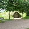
| Dave John Posts: 22335 Joined: 27th Feb 2011 Location: England | quotePosted at 21:27 on 1st May 2014 During the last year or so John has shown an interest in processing programmes and shooting in RAW and has asked questions and I've tried to help where I can. After all that is partly what the site is about is it not? Just last week I gave him a link to a free programme on offer through DIGITAL CAMERA magazine.If anyone wants a copy send me a pm and I'll copy you the download info. He sent me a couple of examples of the previously mentioned woodland scene. One was his original and the other an edited version where he had made considerable improvement to colour and contrast, maybe you should put the edited version up for comparison John.... With the sudden interest in B&W I knew this would be suited to the process so simply did a very quick B&W conversion, a bit of dodging and burning and a slight curves adjustment, took less than 2 minutes John liked it and is now coming round to being a B&W fan. If you do try B&W conversion don't be afraid to go for strong punchy images unlike some of the fairly flat ones that appeared a few days ago. Successful B&W generally relies on a full range of tones from Black to White with good strong contrast. This particularly applies to landscapes whereas Portraits can live with a predominance of darker tones, known as LOW KEY, or where the predominance is towards the lighter tones, HIGH KEY. |
| Vince Hawthorn Posts: 12758 Joined: 19th Apr 2010 Location: UK | quotePosted at 22:47 on 1st May 2014 I like John have not dabbled to much in monochrome recently unlike the old days of D&P in a home made darkroom in an extended bedroom cupboard. However every so often I might try a black and white or more often a sepia. Sometimes it is a case of needs must as in the case of my example here. The shot of the old boy ( even if he is only a mannequin ) was originally a normal colour shot but the diamond you can see is bright yellow and very distracting so a quick turn into black and white and you can see the result. Since then I do now have a another version in colour having got the knack of some basic retouching.  Picture by Vince Hawthorn |