Please login or click here to join.
Forgot Password? Click Here to reset pasword
 |  |  |  |  |  |
| cathyml Posts: 23275 Joined: 25th Jan 2010 Location: South Africa | Posted at 22:07 on 8th October 2010 From an artist's viewpoint this pic works:- 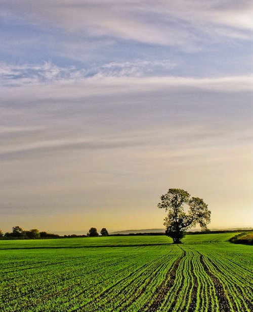 Picture by Mick Carver
Here are some of the reasons:- The eye is led by the furrows to the tree (a focal point) and draws us into the picture, but note that the tree is not sited in the centre of the pic (which would act as a block) but offset slightly to the right, which allows the eye to travel further into the picture to the background trees and hills. Mick has also very effectively used the rule of thirds. The fields and distant hills occupy the lower third of the picture. The upper third is very cleverly suggested with the variation of the clouds and sky. The variation in the sky colour also creates interest but doesn't detract from the focal point (the tree). The warm green of the new plantings in the foreground brings this part of the pic towards us and the greyer/darker colours of the background trees and hills recede, creating the illusion of distance and adding depth. Let me say again that this is my opinion as an artist, not as a photographer! So please feel free to put your own point of view.
|
| James Prescott Posts: 25952 Joined: 11th Jan 2010 Location: UK | Posted at 22:14 on 8th October 2010 interesting post cath i for one wouldnt have noticed that --see you learn something every day. good point. |
| Cathy E. Posts: 8474 Joined: 15th Aug 2008 Location: USA | Posted at 23:08 on 8th October 2010 You said it all Cath!! I agree with your opinion!  |
| cathyml Posts: 23275 Joined: 25th Jan 2010 Location: South Africa | Posted at 08:29 on 20th October 2010 Here are some more pics using the furrows again. I'd like you to compare and consider, does one work better than the other? If one has the edge do you know why you have a preference for it? In the one you follow the furrow to the house directly, in the other there is a furrow either side of "you" leading to the house, does it make any difference? I'd love to hear your thoughts on this. 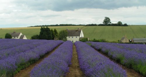 Picture by Adam Engberg 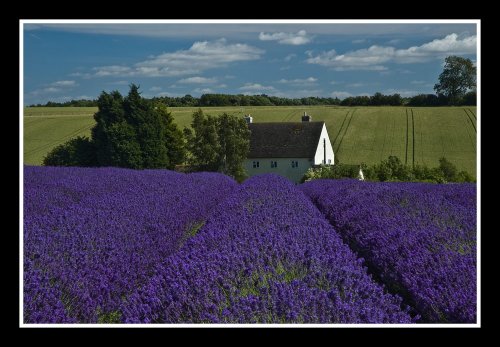 Picture by David Venables How do you feel about framing the pic? Does it add anything to the overall effect? |
lancashirelove Posts: 1986 Joined: 18th Feb 2009 Location: UK | Posted at 09:40 on 20th October 2010 Re Mick's pic-great! However perhaps the use of a filter or paintbox type App would bring out the sky a little more, adding drama to the finished result? |
| cathyml Posts: 23275 Joined: 25th Jan 2010 Location: South Africa | Posted at 10:03 on 20th October 2010 Hi Mike! Could you post any examples on here on how that can work? Maybe one without and one with filter/paintbox app - its a good photographic point, and one I would really like to see. |
Shaun Wilson Posts: 1832 Joined: 23rd Dec 2009 Location: UK | Posted at 22:17 on 20th October 2010 Your right Cathy it’s all the rules of photography and art together but all the points you have made are right please put some more on :) |
| cathyml Posts: 23275 Joined: 25th Jan 2010 Location: South Africa | Posted at 22:19 on 20th October 2010 Only if you make comments on the two lavender field pictures with the houses above, lol. Really want to hear how others feel about them. Get everyone to really LOOK at the pics. |
Shaun Wilson Posts: 1832 Joined: 23rd Dec 2009 Location: UK | Posted at 22:26 on 20th October 2010 I like Adams photo as its more Natural and David I think is very good as its been taken so close or cropped and framed and some how its been made more personal or that’s the way it feels to me anywa. :) |
| cathyml Posts: 23275 Joined: 25th Jan 2010 Location: South Africa | Posted at 06:45 on 21st October 2010 Thanks Shaun, those are both very valid points. Adam's pic is slightly more distant and invites you to wander around a little more (more open) and the overcast conditions make it a calm quiet picture while David's pic gives you a tighter focus on the house, and the brighter light, from the side, creates deeper shadows and brighter colours creating a more "active" pic. BOTH WORK! The furrows in both lead the eye to the "focal point" (the house) and then the lines in the field behind the house draw you eye up to the horizon with its row of trees (but your eye doesn't stop there!). Both also have interesting skies and have, more or less, used the rule of thirds, and both have a good sense of depth (distance), and of course both have a story to tell!
|